Central de Asistencia

Obtenga un panorama más claro del seguimiento de su proyecto.
Informes personalizados
Paso 1: Defina sus datos
Paso 2: Diseñe un esquema
Paso 3: Vea, exporte y comparta
Diseños avanzados
Informes imprimibles para Costos
Paso 1: Defina sus datos
Paso 2: Haga un diseño
Paso 3: Vea, exporte y comparta
Processes configured in Dashboards only apply to the Dashboards. They do not affect other areas of Aconex such as Mail or Documents.
As an example, this scenario may occur if your process is configured to ‘auto close in X days’. This means you'll see the status of Responded when viewing the mail itself. However, in Dashboards the process is 'Closed Out' due to the configuration of that process in Dashboards.
Dashboard configuration does not Close Out the mail itself.
We don't recommend this. While the offline editor allows you to drag and drop attributes from different subject areas (that are not linked) in the same chart, doing so will give you incorrect output.
Yes, using BI Publisher (Plugin) Template Builder in offline RTF layouts. Learn more
Yes. If you are creator of the report that is shared across projects, you can edit it only from the project where you created it.
If you have minimum access permission Create Project Org. Reports, you can also edit (except Share) the report that is shared with all users from your organization across projects, but only from the project the report was created.
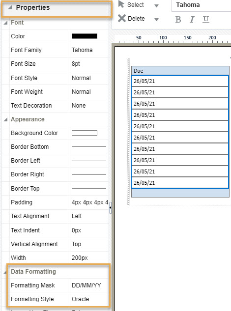
Sí. En el editor de diseño en línea puede seleccionar el campo de fecha o la columna de la tabla y, a continuación, seleccionar propiedades en el panel izquierdo. En formato de datos, introduzca el formato de fecha que desee en la opción máscara de formato. También le recomendamos que seleccione el estilo de formato como ‘Oracle’.
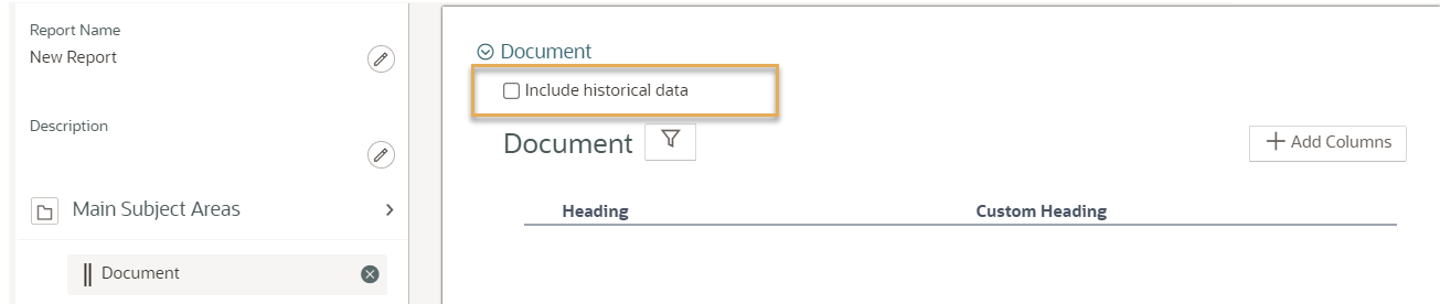
Sí, en el editor del modelo de datos elija Documento como área temática principal. Seleccione la casilla "Incluir datos históricos". Si Documento es un área temática de apoyo, devolverá los datos del historial de forma predeterminada.
For Mail you can use the ‘sent month’ attribute. For other subject areas you will need to code your own logic for this. (e.g. 1/1/2001 = Jan, 1/2/2021 = Feb etc.. ). Use the Case-Switch statement to create a chart with an axis showing monthly data.
Sí. Descargue la plantilla como archivo XPT y luego cárguela como diseño para otros informes. Esto también funciona en proyectos diferentes. Consulte Reutilice una plantilla de informe (diseño)
Es una buena idea guardar en su ordenador los archivos de plantillas que utilice con frecuencia, para poder añadirlos rápidamente a su próximo informe.
Yes. If you have the required access permission, open the report from the project you created it in, and select to share it across all projects you have access to.
A report you created can only be shared across all projects that you have access to.
No. A user from an organization can view a process in dashboard only if the organization is involved in that specific process. This helps everyone see just what's needed. If an organization on your project can't see a process on their dashboard, it's because they aren't part of that process.
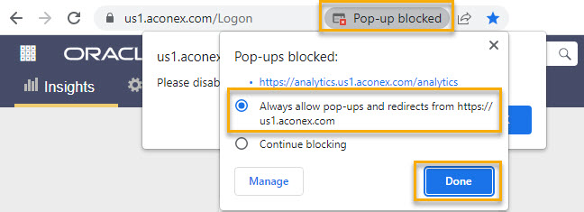
Make sure pop-ups are allowed for the Aconex instance URL (for example us1.aconex.com). Also see Configuring your web browser
Seleccione la tabla. Despliegue el panel Propiedades de la izquierda y vaya a Apariencia. Utilice la opción Margen.
Expanda el panel de Propiedades de la izquierda y encuentre Título del gráfico. Establezca Visible como Verdadero.
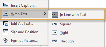
Copy and paste or use the Insert function in MS Word to add an image/logo into the RTF layout. We suggest you use .PNG or .JPEG image types. Make sure you right click on the image(s) and select Wrap Text > In Line with Text.
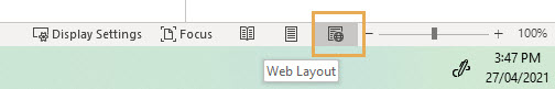
Switch to web view so you can scroll across the page. This web view is available on the status bar at the bottom of the Word file – it’s called Web Layout.
In the layout editor, expand the Properties pane on the left and scroll to Chart Plot Area. Set Data Visible as True to view data labels in the chart. Use the Data Font Bold/Colour/Italics/Size & Data position options to format the data labels. En el editor de diseño, expanda el panel de Propiedades de la izquierda y desplácese hasta Área de trazado del gráfico. Establezca Datos visibles como Verdadero para ver las etiquetas de datos en el gráfico. Utilice las opciones Negrita/Color/Itálica/Tamaño y Posición de los datos para dar formato a las etiquetas de datos.
Utilice el componente Imagen del panel Insertar de la parte superior y seleccione una imagen de su ordenador. Le sugerimos que coloque la imagen en una cuadrícula de diseño para una mejor alineación.
Expanda el panel Propiedades de la izquierda y localice la sección Total de filas o Total de columnas. Establezca la opción Mostrar en Ninguno, lo que elimina la visualización de totales para la tabla dinámica.
En el editor del modelo de datos, haga clic en Añadir columnas para ver la lista de atributos disponibles (campos de datos) para el área temática seleccionada. En esta lista, seleccione o anule la selección de las opciones según sea necesario, haga clic en Aceptar y, a continuación, en Guardar el modelo de datos.
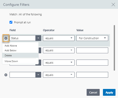
In the data model editor, click on the Filter icon to view and configure filters. Complete the Field, Operator, and Value options to set the filter. To remove a filter, click on the gear icon and click Delete. Click Apply and then Save the data model. To add more filter rows, click the gear icon and select the add below/above option.
In the data model editor, select ‘Main subject area’ or ‘Supporting subject area’ to get a pop-up window where you can select or deselect the subject areas.
From the Insert panel at the top, locate Page Elements to add a page number.
Expanda el panel Propiedades de la izquierda y localice la sección Valores del gráfico con opciones para dar formato al eje.
Despliegue el panel Propiedades de la izquierda. En cada sección, ajuste las opciones de formato para el tamaño, tipo y color de la fuente. Por ejemplo, en la sección Leyenda del gráfico, hay opciones para ajustar el tamaño de la fuente, el tipo y el color del texto de la leyenda.
In the layout editor, expand the Properties pane on the left and scroll to Charts. Set the Background Color option as required.
You can also scroll to the Chart Plot Area section in the Properties pane and use the Series Color option to change the graph series color.
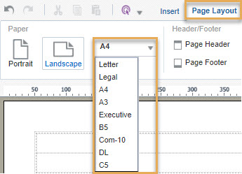
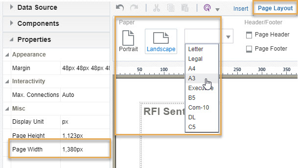
From the Page Layout panel at the top, select the orientation and size (for example, predefined A4, A3, B5) from the Paper section.
To change the margin size, select the page by clicking on the margin then go to Properties on the left panel. Click the Margin option under Appearance. From here you can also adjust the Page Height and Page Width under the Misc section.
The child or supporting subject area has secondary attributes linked with the selected main subject area. For example, Documents can be attached to mails, therefore the attributes of the documents such as document type, document created by, document discipline, are secondary attributes for mails as the main subject area.
En la lista de informes personalizados, pase el ratón por encima del nombre del informe hasta que vea el menú elipsis (tres puntos). Haga clic para obtener una lista desplegable y haga clic en Editar modelo de datos.
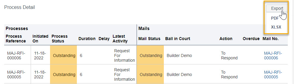
Click Export to download the Process Details table into excel or PDF.
From the table select the column you want to sort. Select the table and click the Column tab at the top. Adjust the Sort option as required.
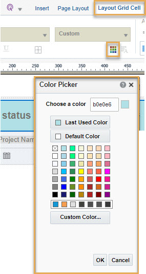
Use a Layout Grid to drop all your components. Select the grid and from the Layout Grid Cell tab at the top, click the Background Colour icon to open the Colour Picker. Choose the required color for the background of the grid.
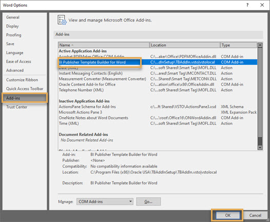
After you have installed the plugin, open Microsoft Word and click File from the menu bar at the top.
Click on Options from the left panel. From the dialog box select Add-ins on the left and select BI Publisher Template Builder for Word from the Add-ins list.
Click OK.
La actualización de datos del panel de control es diferente para cada instancia. Tenga en cuenta que se trata de valores aproximados.
| Instancia | Los datos del panel de control se actualizan aproximadamente cada |
| AU1 | 6 horas |
| AU2 | 30 minutos |
| CA1 | 15 minutos |
| CN1 | 30 minutos |
| EU1 | 15 minutos |
| HK1 | 2 horas |
| KSA1 | 1 hora |
| MEA | 3 horas |
| UK1 | 3 horas |
| US1 | 1 hora |
Nota: Su preferencia de zona horaria se utiliza para mostrar la hora de actualización.
Si no ha configurado su zona horaria, se utilizará la configuración a nivel de organización.
Si su organización no ha establecido una zona horaria, entonces se utilizará la zona horaria predeterminada para la instancia de Aconex.
For the report to be available in the new project, you will have to once again share the report across projects after accessing the new project.
If you add a new mail based process or edit an existing one, it appears in the Dashboard only after the next data refresh. See How often is Dashboards data refreshed
Yes, if you edit a report then those changes will apply to that report on all other projects it was shared across.
Office 365 is now certified with the BI Publisher Desktop Template Builder.
See the certification
To install the add-in, download Oracle Business Intelligence 12.2.1.4.0 (the recommended version). Choose the BI Publisher Desktop based on your version of Microsoft Office 32 bit or 64 bit.
Yes. There is a limit on the number of records that can be requested from each subject area while running a report.
These limits ensure high performance while processing the real time data required for your report.
If the limit is reached, only the records within that limit will be available in your report. You may need to filter your report to get most relevant data within the limit.
The below table shows the limits for each subject area.
|
Subject Area |
Maximum number of records in your report |
|
|
10,000 |
|
Workflow steps, Workflow |
10,000 |
|
Field issues, Field inspections |
10,000 |
|
Documents |
50,000 |
There is no limit on the number of columns you can add in a table. To add more columns, you can either:
If you are directed to this page from an error message in Aconex, you can find the error below and find out what to do next.
This error is caused by a temporary issue in Aconex, or a special character in your chosen data.
Confirm if there's a temporary issue in Aconex
Find and remove unsupported special characters
This error is caused by:
Confirm if there's a temporary issue in Aconex
Check the layout matches the data model (using the online editor)
Check the layout matches the data model (using the offline template builder)
Generate a preview when using the MS Word template:
Find and remove invalid characters
Reduce the volume of data requested in the report
If there are no invalid characters, then the report may fail due to the amount of data being requested. Use filters to reduce the amount of data in the report and try again.
If you are still unable to run your report, please raise a request with Oracle Support. Include a HAR file, along with screenshots of your data models, layouts, and filters used in the report.
The report may have exceeded its data limit. Use the prefilter & view report option from the three dots menu to refine the data in the report.
Some special characters are not supported as filter input values. Please check and remove special characters from your filters.
It may be the document version isn’t yet available in your document register. Some organizations are configured to require a manual update of the Document Register using the ‘Update Register’ button. Once your register is updated try the report again. If the issue persists contact Oracle Support.
Tables, Pivot Tables, Conditional formatting, Charts and more are available. View Layout Components in the Offline Template Builder
Available charts include Area, Bar, Bubble, Line, Pie, Funnel, and more.
Change the chart type by clicking on it then clicking the Chart tab at the top. Select a Chart Type as required.
Esta permite ajustar los filtros al ejecutar el informe. Esta opción debe estar activada en el área temática principal antes de que pueda utilizarse en un área temática de apoyo
Si elimina campos de datos o atributos que se están utilizando en un diseño de informe, el informe se cargará pero mostrará celdas o gráficos vacíos donde se utilizaba el atributo eliminado.
El área temática principal contiene todos los atributos directamente vinculados a un campo determinado. Por ejemplo, Correo como área temática principal contiene atributos como fecha de envío, lista de destinatarios, tipo de correo, etc. que están directamente vinculados con los correos.
This occurs if the width of the content, chart, or table you added in the layout extends outside the page width. As an example the table may have too many columns.
To resolve this you must increase the page width by following these steps:
TIP: To check the alignment, you can open the Aconex report view page in another tab of your web browser and refresh it. Continue adjusting the page width until you see the alignment is correct.
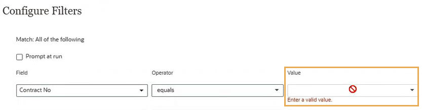
Para que el filtro de número de contrato del editor del modelo de datos liste valores en la lista desplegable:
These are the attributes that are available in the project the report was created, but are missing from this project. See Considerations when sharing reports across projects
If it’s not a shared report then check if there are values created and assigned for the given attribute. If yes, and still you are unable to select or view values in those filters then please contact us for troubleshooting.
This could occur for several reasons:
Optionally you can open the report and click Save As to save a copy of the report. You can then edit and share the copy with others (based on your access permissions).
This issue can occur when reports have filters applied in the layout with English values.
As a workaround, try:
1. Run the report.
2. Click Save as to save a copy of the report.
3. Find the saved report in the listing page (custom tab)
4. From the more options (three dots) menu click Add/Edit Layout to open the online layout editor.
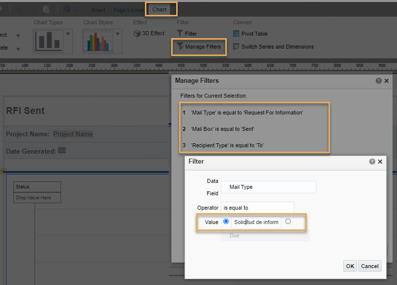
5. Click on the chart that isn’t displaying data in the report view page.
6. From the Chart tab click Manage Filters.
7. Click on each filter and enter the appropriate translation for each English value. For example, 'Request for Information' will need to be changed to 'Solicitud de información (RFI)' if your language is Spanish.
8. Save and then run the report again.
If a project is not displayed on your portfolio page:
The Cost reports are only available if you, your project, and your organization have access to Cost. Insights don't support shared workspaces, so if you access your clients' data via a shared workspace, you won't see Cost reports, even if your client has them.
If you should have access, are logged in, and can't see the Cost reports, we recommend:
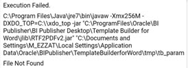
This error happens when you login, load the XML file, pull in a field or two and then run the preview feature. It’s related to the JRE version installed. To fix the issue:
Transmittal History reports or custom reports with Documents and Mail Transmitted subject areas require the permission “Run a transmittal history report” (under User Roles). Please contact your organization administrator to grant this permission to your user role.
If you still receive the error, the reports server may be under maintenance. Please try after some time.
If the report continues to fail, raise a support request and attach a HAR file.


