Create a report layout using the online editor

Design your report with the online layout editor.

Following our video series to create a custom report? You'll find the links for each step below.

After configuring the report data model, the next task is to design its layout. You can produce multiple layouts for your report, allowing you to represent your data in different ways. This allows you to answer many different business questions using the same set of data.

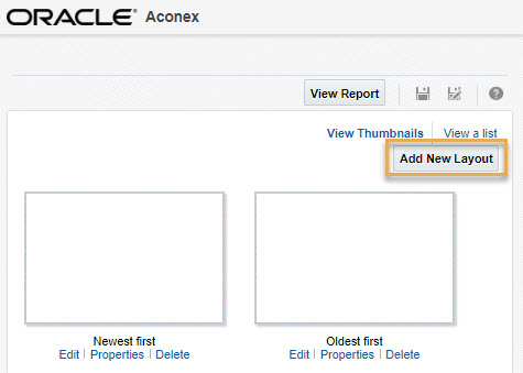
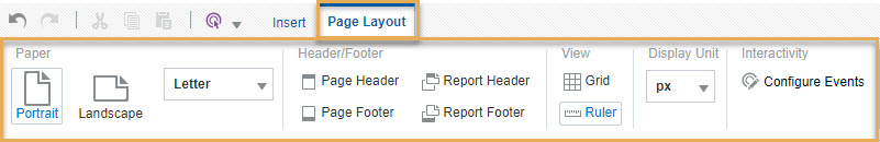
Report Layouts can be produced either online or offline. This tutorial covers the online layout editor.

Create a new layout

  1. From the custom report tab, click the ellipsis menu for your report and select Add/Edit Layout.
  1. If the report does not have any layouts (that is, if you just created a Data Model), you'll be taken directly to the layout editor. Jump to step 3.

    If the report already has a layout, you will be taken to the layout selection screen. From here, click Add New Layout.
  1. The layout editor will open in a new tab within your web browser. Choose a template to design your report.
    In this tutorial, we’ll select Blank (Portrait) to start with a blank canvas.

Overview of the layout editor

  1. The layout editor has three main sections:
  • The Main Design Area.
  • The Insert tab.
  • The Data Source pane.

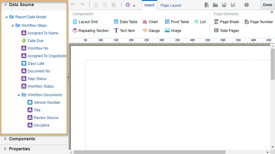
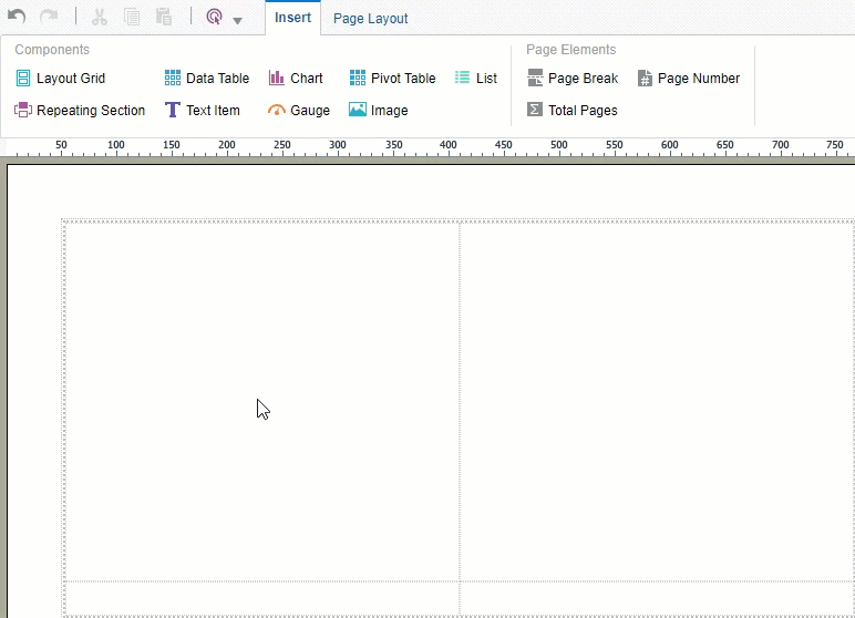
The Main Design Area is where you drag and drop design components and data sources to build the report layout. 

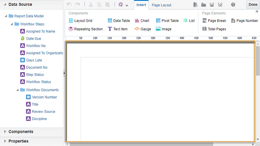
The top toolbar contains the Insert tab, to drag and drop visual design components into the design area. Page elements such as page break and page number can also be dropped into the layout grid or header and footer.

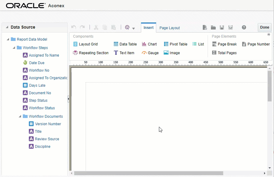
The Data Source pane contains subject areas and attributes you configured in the data model editor. Drag and drop these onto the design components.

Build your layout

  1. To begin, from the Page Layout tab, adjust the report orientation, the paper size and configure headers and footers.

Next, from the Insert tab, drag and drop a layout grid to provide some space for your design components.
When prompted enter the required number of rows and columns for your grid, or just click OK to accept the default grid of 2 x 2.

Tip!

We recommend always starting with a layout grid to help align the various components within the report.

  1. Double click into a cell in your grid layout to display the Layout Grid Cell tab. 
    From here you can center the alignment for dropped components, or add and remove cells. You can do this at any time during the layout design process.

Tip!

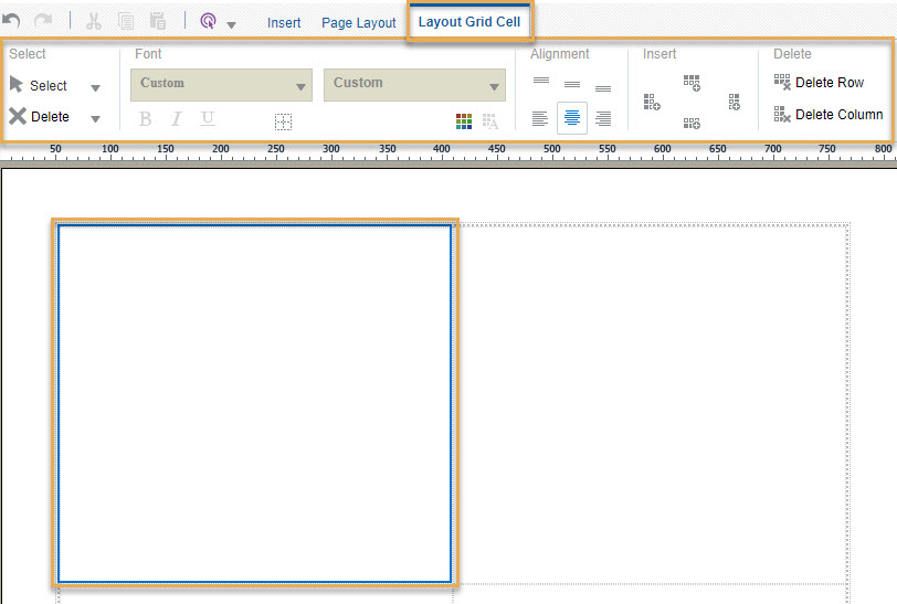
For best results, we recommend adding one design component per cell in your layout grid. You may need to adjust the grid size accordingly.

  1. Next, click on the Insert tab and drag a design component into the grid layout. In this example we’ll insert a Chart
    For the full list of available components, see Using Layout Components
  1. Click on the component you just inserted to customize its look. 
    For example, we can change the vertical bar chart to a pie chart, or change the color and style altogether.
  1. Optionally you can further customize the component from the Properties pane:
  • Appearance: Borders and padding.
  • Chart: Animation, style.
  • Chart effects: Gradient, Tilt, Depth.
  • Chart Legend: Underline, Italic, Font Family.
  • Chart Plot Area: Data Label position, Marker Shape.
  • Chart Title: Underline, Font Family.
  • Chart Label: Rotate, Separator, Font Family.
  • Chart Value: Axis Decimals & Scaling, Currency Symbol.
  • Time Series: Year, Month, Day for axis.
  • Misc: Treat Null value as zero.
  1. Now we are ready to assign attributes to our chart. 
    Select the Data Source pane and drag the required attributes into the Chart as indicated by the ‘Drop Here’ labels:
  • Drop Value Here - Drag and drop the attribute for the Y-axis of the chart. This is the numeric attribute you want to represent on the Y-axis (for example the number of documents).
  • Drop Label Here - Drag and drop the attribute to be represented on the X-axis of the chart. 
  • Drop Series Here - Optionally, drag and drop an attribute for grouping the Value attribute. 

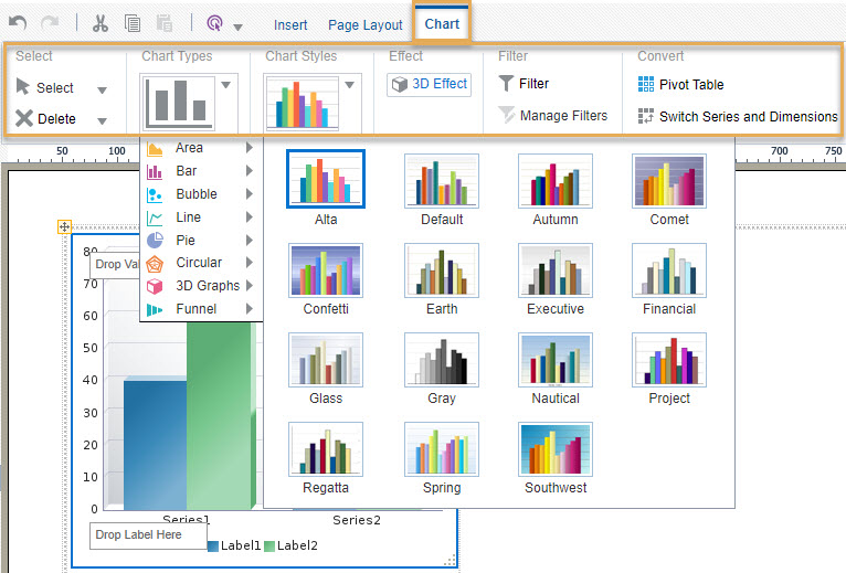
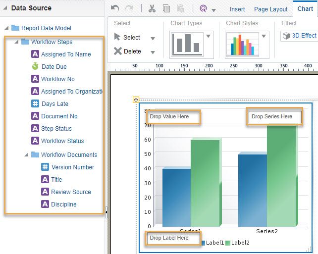
For example, let's say we want to see how our project workflows are progressing. We'll want to see the status of all documents in our workflows, and which organization they are assigned to. 

To do this we'll:

  • Drag the Document Number attribute into the Y-axis Value (to count the number of documents)
  • Drag the Assigned to Organization attribute into the X-axis Label (to chart the X-axis by each organization)
  • Drag the Step Status attribute into Series (to group the count of documents by step status)

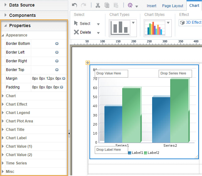
We’ll also make sure the Document Number Value is using a Count aggregation formula, to count the number of documents for each status.

Tip!

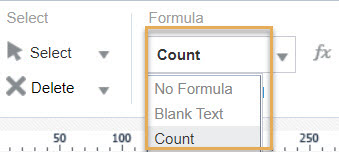
Other aggregations are also available such as Average, Minimum, Maximum, Count Distinct, or a custom defined formula, depending on the data source used.

  1. If required, you can apply filters to your component. To do this, select the component and click Filter from the top toolbar. Multiple filters can be applied to different components in your layout. For example, you may want to filter this chart to only show Architectural documents.   

Tip!

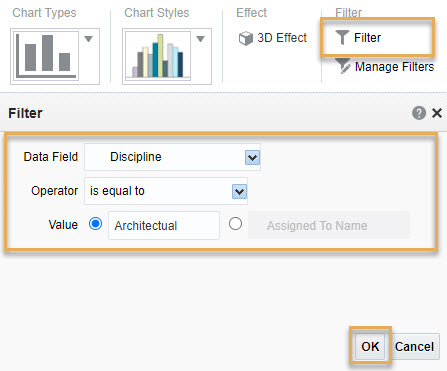
The Value in your filter can be a number or text, but must be entered manually. You may need to check how the value is displayed in Aconex to make sure you’ve entered it correctly.

Finalise your report layout

You’re almost done! Insert any additional components into the design area as required, and drag and drop the applicable attributes into them. 

Once that’s complete, you can Save the layout.


Give your layout a name and click Save.  You'll see a 'Saved' confirmation at the top right of the layout screen.

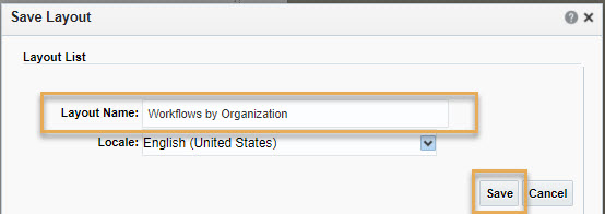
You can also save a copy of your layout to edit later by clicking Save As. Use this option to help you create slightly different report layouts to display your data in different ways.
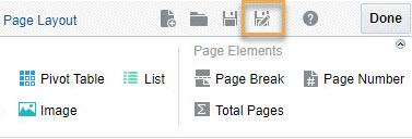
Click Done.

Return to the report listing in Aconex to view and share your new report.