Support Central
Cost delivers a familiar spreadsheet-style interface with built-in, sophisticated features to make navigating and working with your data easy.
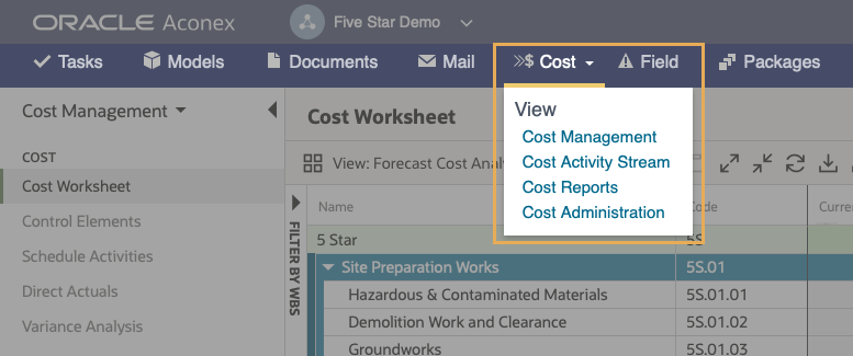
The Cost module appears in the main Aconex navigation menu. To access it, click the Cost menu then select an option, or double click to go straight to Cost Management.
Access to the Cost module is controlled by your Organization Administrator. If you do not have access, contact your Org Admin to grant the appropriate permissions or contact Oracle Support.
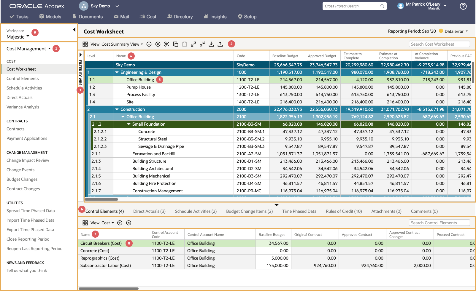
Cost Workspace describes the data and application features you have access to in your organization and projects. The overall interface is shown below using the main cost worksheet as an example.
If you want to access the workspace of another organization, see Accessing a Shared Cost Workspace.
Grids display a table of data in a spreadsheet view and include multiple fields for each record as columns. Each row represents a single record. In some cases, where data can be summarized, the totals are displayed in the summary levels of the hierarchy.
For example, in the cost worksheet grid, totals are rolled-up to each summary level of the WBS, all the way up to the highest level (i.e. project level). Also, the totals from all of the control account records assigned to a WBS element are totaled at the WBS level. These summary calculations are automatically performed when data is added, modified, or deleted.
Many of the screens in Cost have a split grid view with an upper (main) grid, and a lower grid that shows detailed information about the selected record.
Grids are extremely flexible and customizable, allowing you to organize your data in a way that’s most meaningful to you.
You can:
The toolbar for each grid has a View menu that allows you to control which columns are displayed on the grid. You can create multiple views for different purposes as either personal or shared views.
Existing views can be edited by clicking the view menu and clicking the edit icon to the right.
Access both standard and custom views from the View drop-down menu in the toolbar. You also create and delete custom views.
To create a new view:
Some grids have views to display different types of data such as cost, hours, or quantities. A view can typically only display one type of data at a time. This affects the control elements and direct actuals grids.
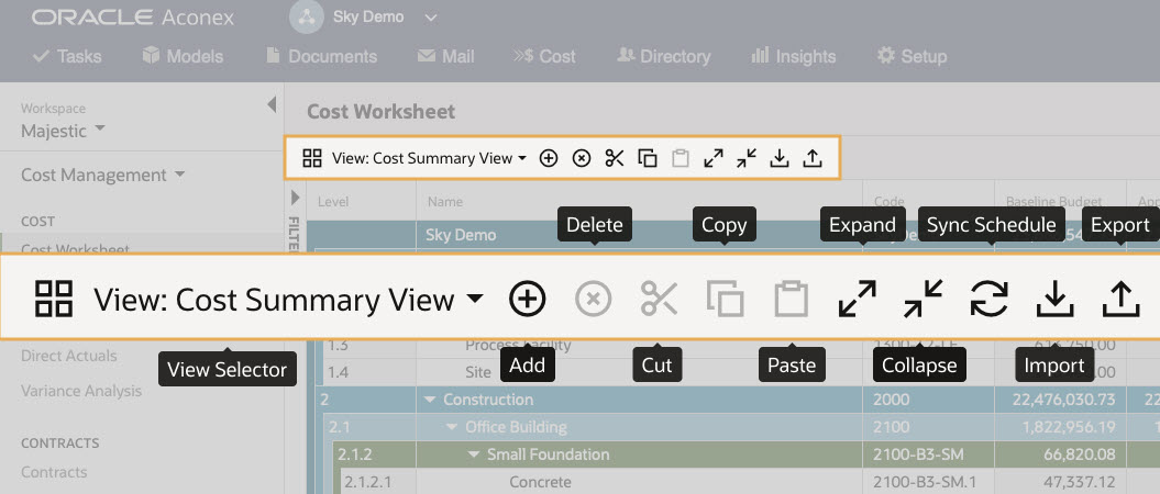
The main toolbar is displayed on most pages above the main grid. The toolbar commonly has actions for add, edit, delete, import, and export, however some pages have unique features. Run your mouse over each icon to see what its function is.
Pages that contain a main and lower grid also have a similar toolbar on the lower grid that controls similar functions for the data displayed.
Common functions included in many of the toolbars are:
All grids have a search feature that allows you to temporarily filter the displayed data to find records that meet the search criteria. All columns whether they are displayed or not are included in the search, making it easy to find records without having to add specific columns.
Some grids have a Filter menu feature that allows you to filter the displayed data based on the project WBS hierarchy. The filter menu is hidden by default but can be displayed by clicking the Filter by WBS link between the main navigation menu and the main grid.


